Basic Configuration
Language
Currently supported language list:
- en: English
- zh-cn: 简体中文
- zh-tw: 繁體中文
- es: Español (Spanish)
- fr: Français (French)
- de: Deutsch (German)
- ja: 日本語 (Japanese)
- ru: Русский (Russian)
- ko: 한국어 (Korean)
Note: Only Chinese (Simplified and Traditional) and English are translated by the author; other languages are translated by AI.
Top Menu Bar
menu:
  XXX:
    path: /
    ico: ico-name
  XXX:
    path: /XXX
    ico: ico-name
    submenu:
      XXX:
        path:
        ico:
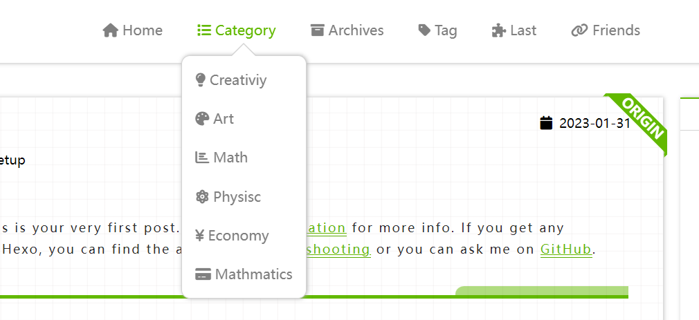
ico-nameis the name of the icon in Font Awesome.-
pathis the link you want the icon to point to. -
submenurepresents a sub-menu.
Blog Introduction
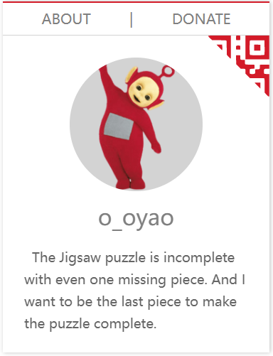
Logo
# by using image or svg
logo:
  on: true
  url: /img/o_oyao.svg
If the logo is enabled, it will replace the `site name`` in the top left corner using an image or SVG.
Avatar
avatar: https://
Specify the URL for the avatar stored in the cloud.
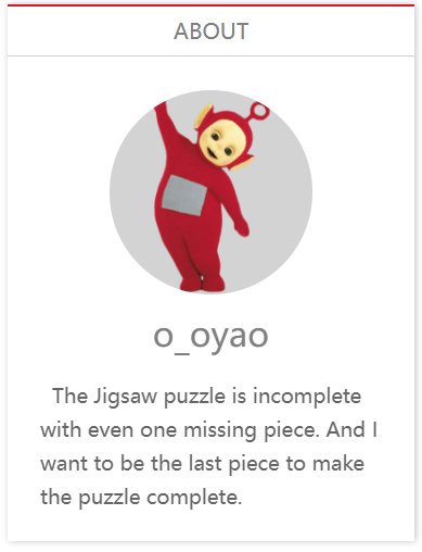
Brief Personal Introduction
aboutme: XXX
A short personal introduction displayed in the sidebar on the article pages.
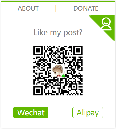
Donation Feature
donate:
  on: true # false
  methods:
    - name: wechat
      enabled: false
      description: WeChat
      qrCode: /img/wechat.jpg
    - name: alipay
      enabled: true
      description: Alipay
      qrCode: /img/alipay.jpg
    - name: zelle
      enabled: true
      description: Zelle®
      qrCode: /img/zelle.jpg
  defaultMethod: zelle
  description: Like my post?
Place the QR codes directly in the hexo-theme-last/source/img/ directory and name them wechat.jpg, zelle.jpg and alipay.jpg.
Preview
Establishment Date
since: 2019
Contact Information
contacts:
  E-mail: " mailto:o_oyao@outlook.com || fas fa-fw fa-envelope"
  ...
  # 微博: " ||fab fa-fw fa-weibo"
  Twitter: " ||fab fa-fw fa-twitter"
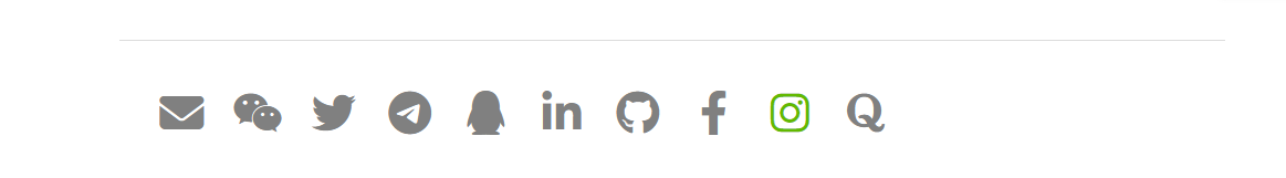
- Display contact information at the bottom of each page.
- Utilize Font Awesome icons.
Adding New Icons
Format: XXX: "url_for(XXX)||icon name of XXX"
url_for(XXX):The link corresponding to the icon.icon name of XXX:The entire content of the class attribute inside the<i class="XXX"></i>tag in Font Awesome.
Homepage Style
Article List Style
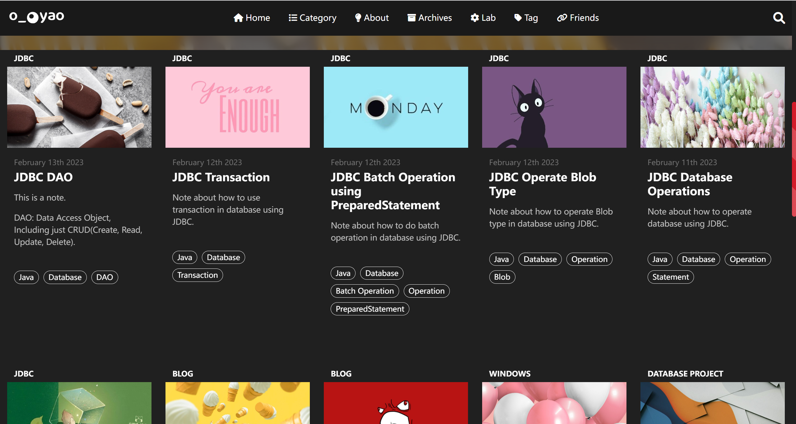
The featured image for each article can be customized or you can use the default featured image.
Custom Featured Image
---
title:
date:
tags:
postImage: https://s1.ax1x.com/2020/09/23/wX2BfU.jpg
description: XXXX
---
Add this configuration to the header of each Markdown file:
postImage: Customized location for the featured image.desscription: Brief description of the article for display on the homepage.
Default Article Cover
PostDefaultImage: https://s1.ax1x.com/2020/04/25/J6iz9K.jpg
For Markdown files without a configured postImage, the default configuration from _config will be used.
Large Image Display
homeCover:
  fixed: true
  url: ""
fixed: Is the background image move upwards with scrollingurl: location of the picture- url
- Or the local path, under the folder
source/img/of theme folder - Or you can leave it blank,and replace the file under theme folder
source/img/home_cover.jpg
Homepage Carousel
The homepage carousel is composed of the featured image and introduction of each article. To set up the carousel, you need to select the content you want to include.
Add the following information to the header of the Markdown file for the articles you want to include in the carousel:
---
title:
date:
tags:
isCarousel: true
---
carousel:
  on: true
  prevNext: true
  indicators:
    on: true
    position: center # left, center, right
    style: line # dot, line
    currentColor:
      color: "#222"
      opacity: 0.9
    otherColor:
      color: "white"
      opacity: 1
  mask:
    on: true
    color: "#000"
    opacity: 0.5
  blur:
    on: true
    px: 5
  textColor: "#fff"
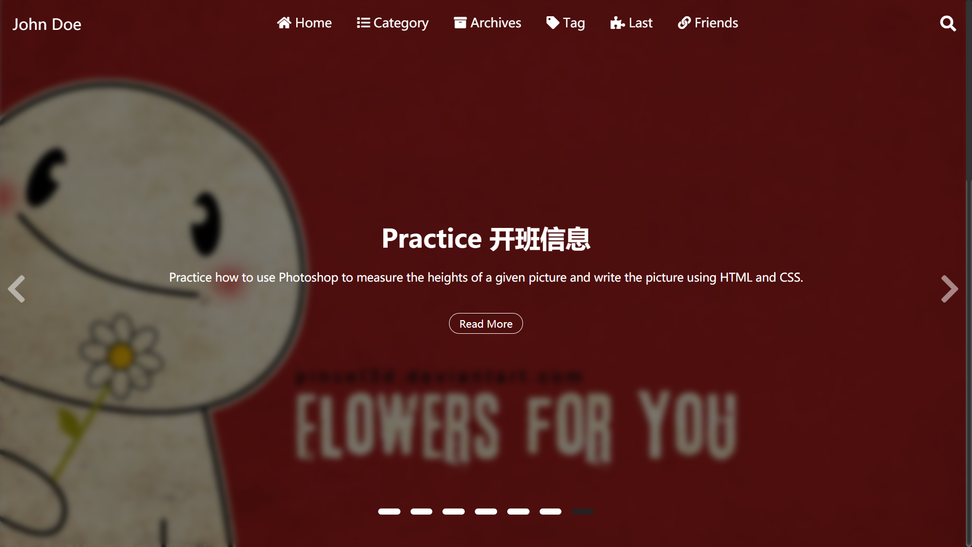
preveNext: Enable arrows on both sides.
indicators:Display indicators below the images.
-
position:Indicators' position (left, center, right). -
style:Indicators' style (dot, line). -
currentColor:Color of the current image's indicator. -
otherColor:Color of the indicators for images that are not current.
mask: Background image shadow mask.
color:The color of the shadow can be represented by any hexadecimal color code or color name.opacity:Opacity of the shadow (0-1).
blur:The degree of background image blur is quantified in pixels (px).
textColor:Color of the text on the image.
Article List Style
clampLines: 8
clampLines specifies how many lines of the description for each article should be displayed on the homepage. It should be an integer.
Article Layout
homeRowMaxItem: 6 ## 3-6
Article Page
Word Count
wordCount: false
Requires the installation of the hexo-wordcount plugin:
npm install hexo-wordcount
Content Expiry Reminder
Warning:
  on: true
  Days: 200
  Content: "This article was written {} days ago. The content of the article may be out of date."
Displayed at the beginning of each article.

- If
warning.onis enabled, each article comes with a reminder. - You can also add
Warning: truein the markdown file of each article to enable the expiry reminder. Dayssets the expiration limit in days.- In the
Contentsection,{}represents the value ofDays, and the remaining text can be modified as needed.
Page Styles
postStyle:
  authorInfoPosition: right
  contentStyle: github
  color: "default"
  codeStyle:
    style: mac # mac, tab
    colorSet: sakura-light # sakura, sakura-light
    # dark style or light style. This is only applied to styles not colorSet
    light: true # false, true
-
authorInfoPosition:Determines the position of the table of contents and the author's avatar, either on the left or right.
-
contentStyle:Options for the style of article pages.
-
color:Main theme color of the article pages.- Default is
default - You can also use color names available in CSS or specify a hexadecimal color code (e.g., #XXXXXX).
- Default is
-
codeStyle: Code block styles- style: Style of the code block.
- colorSet: Color theme for the code.
- light: Whether it's a light-colored theme.
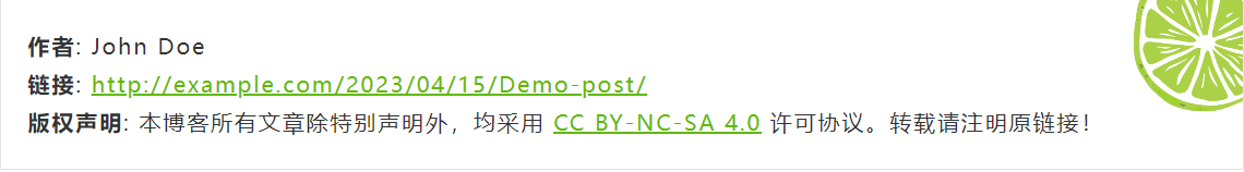
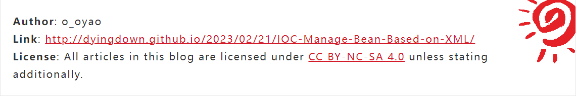
Copyright Information
copyright:
  on: true
  simple: false
  license: "CC BY-NC-SA 4.0"
  fullName: "Attribution-NonCommercial-ShareAlike 4.0 International"
  url: "https://creativecommons.org/licenses/by-nc-sa/4.0/"
  icon: "creative-commons"
simple: Determines the style of copyright information.license: Short name of the license.fullName:Full name of the license.url: URL link to the license.icon: Font Awesome icon name for the license.
For the complex style, the pattern can be replaced by the image at /img/license-decoration.png to achieve customization.

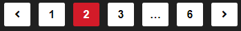
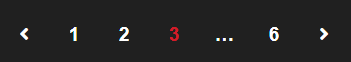
Paginator
Multiple Article Pagination
paginationNumberBackground: true
Single Article Pagination
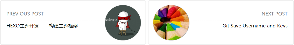
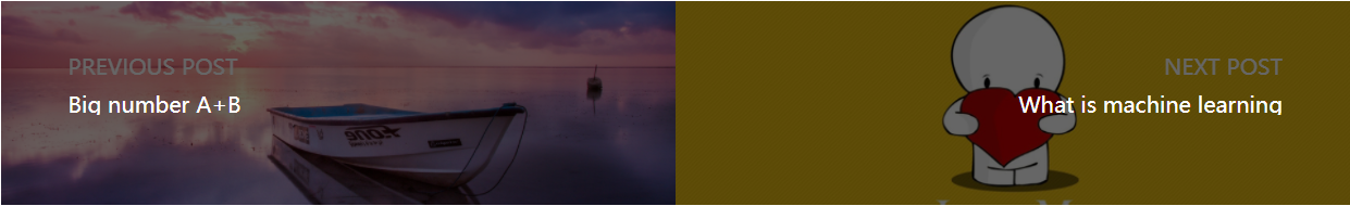
postPagePaginationStyle: card # normal picture card

Scrolling
Back to Top
SideButtons:
  style: "both" # "icon", word", "both"
  Top:
    on: true
    color: "#e37a90" # "#e37a90" hex color
  Comment:
    on: true
    color: "#33a6dc" # "#33a6dc" hex color


Top represents back to the top, and Comment indicates going to the comments section. If the comment feature is not enabled, the button is not displayed by default.
Scrollbar
ScrollBar:
  style: "bicolor" # "bicolor", "simple", "gradient"
  color: "theme" # "default" "theme" "#459798"
  shape: "square" # "square", "round"
  gradient:
    color1: "skyblue"
    color2: "purple"
-
Three styles of the scrollbar.
-
color: Customizable scrollbar color or usethemeto follow the theme color. -
shape: Shape of scrollbar, wether round or square -
gradient: The scrollbar will gradient fromcolor1tocolor2.


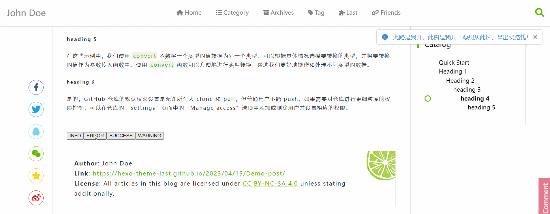
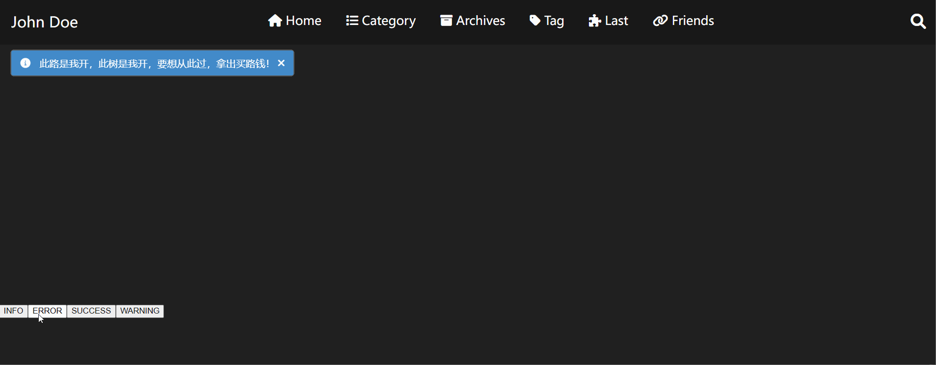
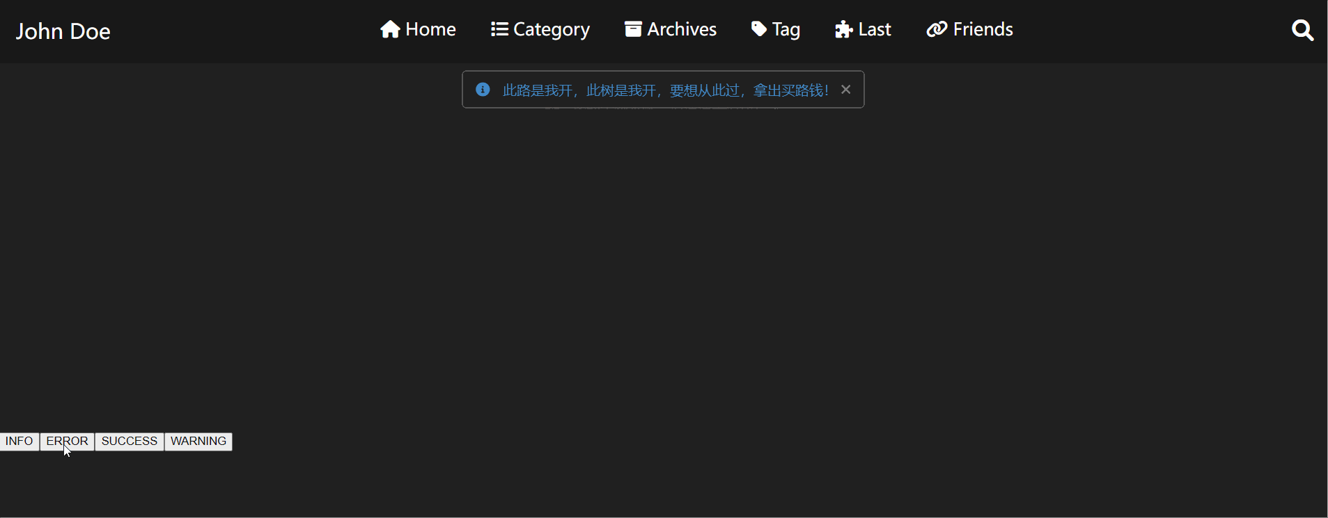
Message Alert
alertStyle:
  colorBackground: false # false will use page's background
  position: right # right, center, left